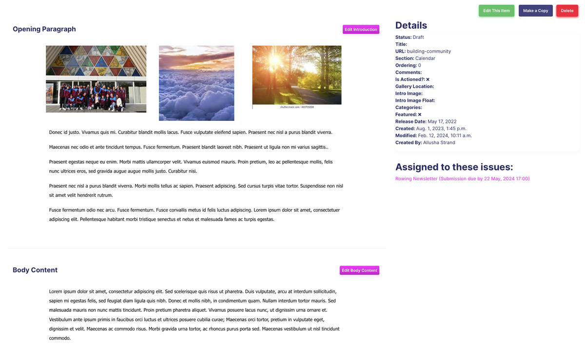
For every News Item, we have 5 buttons:
Edit this Item (Settings page),
Edit Introduction (The content before the Show More)
Edit Body Content (The content after the Show More)
Make a Copy
Delete
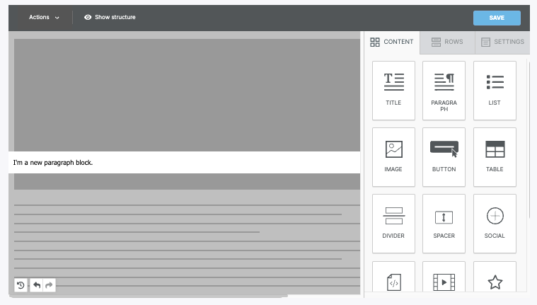
When you open the News builder (Edit Intro or Edit Body), there are two primary sections:
- Stage, which is where you drop content blocks and rows while designing. This is the section on the left side of the screen.
- Sidebar, which is where many of the design elements can be customised. This is the section on the right side of the screen.
There is an icon that separates the builder stage and the sidebar. You can use this to minimise the sidebar at any time.
To begin designing on the stage, you must select a design element from the sidebar. The sidebar includes three tabs to help you create content.
Settings
The settings tab allows you to set defaults for your entire design. When working with rows and content, those design elements inherit these settings.
You can use the settings tab to modify the following options:
- Content area width
- Content area alignment
- Background color
- Content area background color
- Background image
- Default font
- Link color
Rows
Rows are the primary structural element for designs created in the News builder. Within your rows, you can customise the column structure. With a multi-column row, you can place content side-by-side in your design. Most importantly, rows act as a container for all of your content blocks.
The following options populate in the sidebar when working with rows:
- Row background color
- Content area background color
- Content area rounded corners
- Content area border
- Do not stack on mobile
- Reverse stack order on mobile
- Row background image
- Hide on
As mentioned above, rows can include columns as well. As a result, there is a second section called Customise columns. You can use this section to modify the column structure. There is an +Add new button you can use to insert new columns. A separator icon populates between each column. Click and drag the icon to change the column structure.
For each individual column, you have the following options:
- Column background colour
- Padding
- Border
To toggle between columns, click on the column in the sidebar you want to modify. The selected column is highlighted.
Content
There are many several content blocks you can use while designing in the News builder. All content blocks include padding settings and hide-on settings in the sidebar.
Below we've listed all the available content blocks. Click the name below to learn more about the associated type of content block.
- Title
- Paragraph
- List
- Image
- Button
- Table
- Divider
- Spacer
- Social
- HTML
- Video
- Icons
Mobile Design Mode
By default, the builder stage mimics what your design will look like on a desktop device. However, you can also use mobile design mode to build your content. This design mode uses a stage that mimics what the design will look like on a mobile device.
Most of the edits you make in mobile design mode are reflected on both the desktop and mobile versions. However, certain elements are marked with a mobile icon in the sidebar. These settings will only apply to the mobile version of your design.
Preview
The preview feature is fairly self-explanatory. You can use this feature to see what your design might look like on a mobile or desktop device. You can also use the dark mode toggle to see how dark mode settings may impact your design. If using display conditions, you can also preview how they will impact your design.
Note that the preview is an approximation based on the most popular devices and programs. This is particularly important when working with emails or using dark mode preview. Devices and email clients have different settings causing your design to render differently.